audioparty
A rate and review and music listening habit tracker.
Design Process
Click any button below to explore the different phases of this project.
PROJECT INSIGHTS:
Whether you’re deeply obsessed with music or you’re looking to expand your knowledge, it can often be overwhelming to dive in and just start listening. There’s a nearly endless pool of songs, artists, and genres making it almost impossible to know where to start. Because of this, word of mouth and peer recommendations are a widely used tool for learning about new and existing music. Another element that adds to the overwhelming pressure to stay in-the-know is the inability to track the music you listen to, in an organized way. How do you know which albums you’ve listened to? Or want to listen to? While who and what we listen to is important to a lot of folks, so is how they listen and how their interests and habits change over time.
During the discover phase, I first wanted to learn how users are tracking what they listen to as well as their listening habits and whether there's a product in existence that can do both.
DISCOVER
The Problem
Streaming technology transformed the music industry. There is now added pressure on musicians as well as fans to constantly be keeping up with new releases while being educated on music from the past and their influences. Additionally, apps like Spotify have identified ways to gamify habit tracking when it comes to music with tools like their Spotify Wrapped mobile presentations and playlists like On Repeat. However, there isn’t currently a tool that accounts for tracking the development and growth of our musical interests and also allows us to track what we’ve listened to, leave reviews, and receive recommendations while also building a social network.
Goals
Design flows that are intuitive, seamless, and transparent to users.
Build consistent branding with UI displaying clear visual hierarchy that also feels familiar.
Offer competitive features that would incentivize a user to want to engage with the product.
The Solution
Create an app that allows users to rate and review albums they’ve listened to and track their music listening habits.
Primary Research
For my primary research, I interviewed six different people. Their habits ranged from big time music lovers to less concerned with keeping up with it. Ages ranged from 28-73.
6 out of 6 participants said they never feel on top of all the music they want to learn about.
100% of interviewees said they look forward to and view their Spotify wrapped to see what their interests for the year look like.
4 out of the 6 people interviewed said they wished the popular music streamers had a way of more efficiently tracking albums you want to listen to in the future.
3 out of 5 participants acquired most of their music via illegal downloads, while the others used an even mix of buying individual tracks and illegal downloading.
Key Takeaways
Secondary Research
For my secondary research, I used the same strategies as the previous capstones to understand what options were out there for folks who may want a product that would allow for all three objectives: rating and reviewing music, habit tracking, and social engagement.
I analyzed more direct competitors like Musicboard and Last.fm. While these products had strengths like clear visual hierarchy, onboarding cards, and an Events tab for in-person shows, none of them offered all three of the features I was looking to include in my product. Additionally, there was a large ad-presence on both applications with some features on Musicboard guarded by a paywall.
I also looked at indirect competitors, Apple Health and MyFitnessPal to see how their tracking features were organized and operated. Both products gave me some great ideas for my app, like a Favorites option, clear containers to categorize genres, and varying visual displays of metrics.
That said, there were a couple of weaknesses I wanted to account for when it came to designing my app like a lack of clarity when it came to icon usage, limited communication on where certain information would exist in the interface.
Click on image to expand.
DEFINE
When it came time for the Define part of the design process, I wanted to ensure I was incorporating the most important details from the User interviews and Competitive Analysis into a realistic prospective customer.
User Persona
As I synthesized my interview responses, I noticed that all users felt a decrease in how they actively stayed on top of music trends and artists they loved as they’ve gotten older. They all identified as “music lovers,” yet the responsibilities of their adult lives paired with the pace that the music industry moved made it easier to rely on Spotify and Apple Music algorithms to find new music. These are great options for fast, easy listens, but also takes some effort to reform what the algorithm knows about your tastes. How do you do that when you’re not actively looking for anything new?
This informed me as I created this project’s User Persona: Nadia. A full-time music journalist whose life is led my music discovery. However, she’s found that unless she’s being shared music at work, it’s hard to discover new music on her own. Because of this she’s fearful her work will suffer as she won’t be able to escape the algorithm’s echo chamber of music to find new artists to write about. Additionally, a large part of all of her friendships is discussing music, so there’s also a mounting fear that she won’t have much to contribute. Nadia needs an app that allows her to track what she’s listened to as well as see what others are listening to so she can grow past her predilections.
Click on image to expand User Persona.
While the research part of the project was very apparently important to the design process as a whole, I was really excited to finally dig into the the user flow and site layout and design to bring the ideas I had been visualizing to life.
DEVELOP
User Flow
With the User Persona of Nadia guiding me. I deliberated over the flows that would be most important and relative to her and users like her. Because better tracking of what she has and hasn’t listened to is important, I wanted to create a rate and review flow and a flow to add an album to a Listenlist so she can store albums to listen to at a later date. Lastly, there would be an option to view analytics related to listening habits and to track how they’ve changed.
For this project I focused on the three flows below.
Goals
Empower users to listen to different kinds of music.
Educate them on genres they’re not familiar with.
Allow them to build connections based on music recommendations.
Track their growth when it comes to music taste and
listening habits.
Wireframing
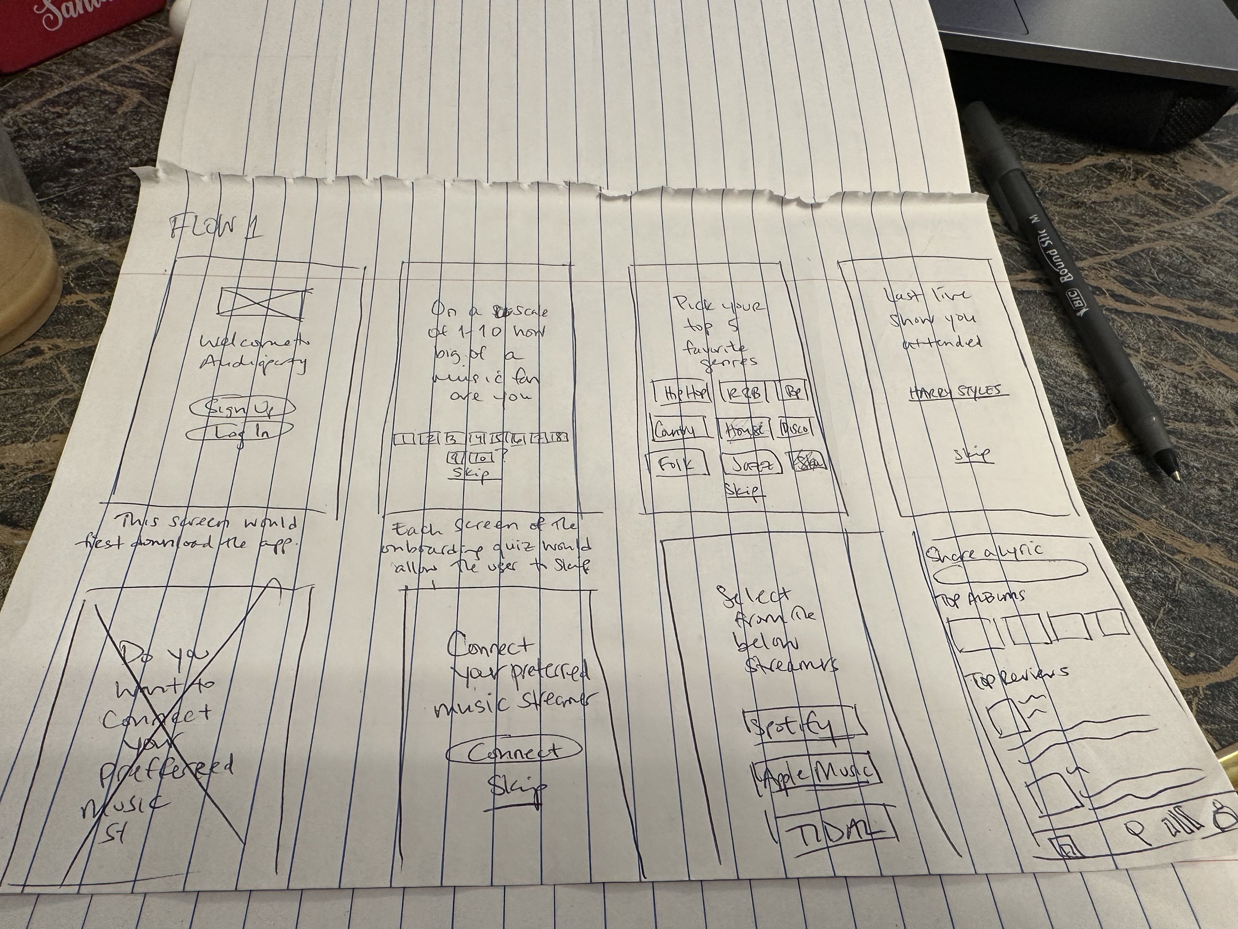
Once I had each flow mapped out I started wireframing. It was during this phase I realized that adding an album to a Listenlist could happen within the rate and review flow. Because of that, I wanted to add another layer of complexity to the project, so I decided to switch the flow to showing a new user’s path to creating an account and taking the onboarding quiz.
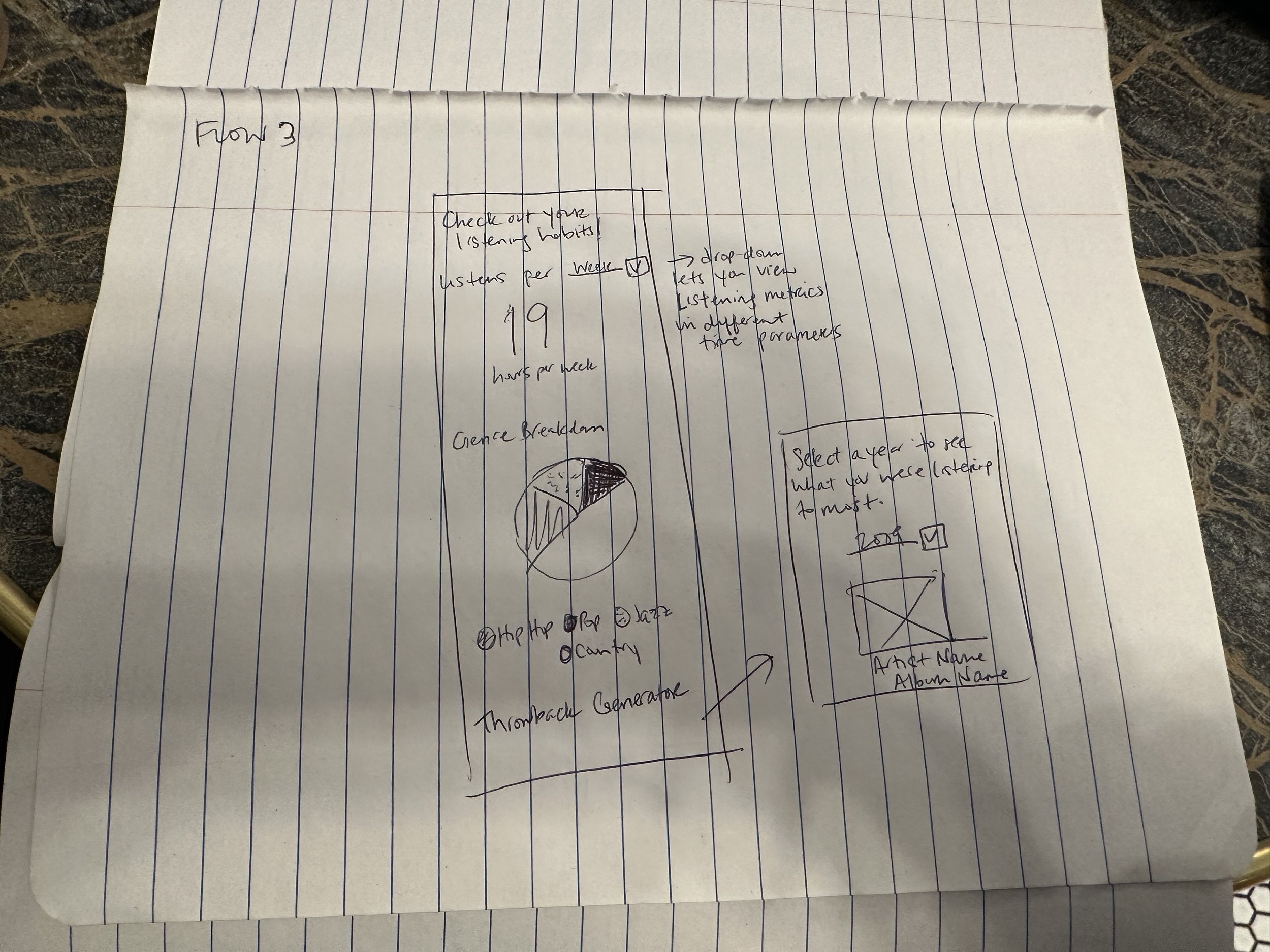
Below is the first (rough) version of paper wireframes.
Flow #1 - Creating an account/Onboarding quiz
Flow #2 - Rate/Review
Flow #3 - Viewing Analytics
Branding & Style
I feel as though the design of a Style Guide up until this project wasn’t something that came extremely naturally. So for this project, I experimented with a different format, taking inspiration from Apple’s UI Kit design.
High-Fidelity Mockups
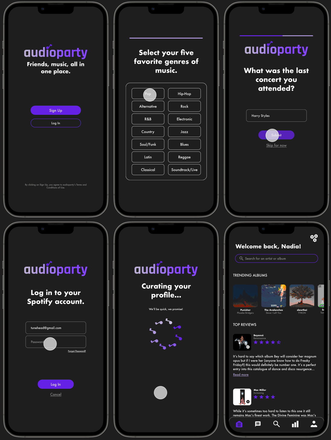
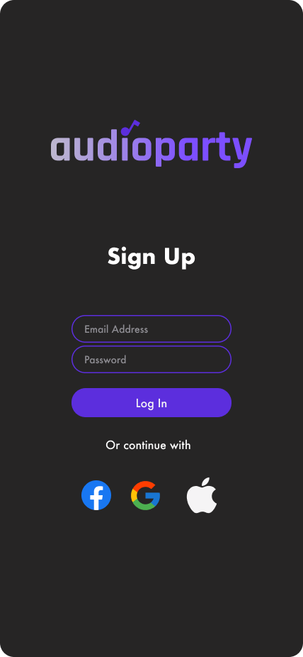
Now that I finalized my style guide, it was time to build the high fidelity mockups. The first row are the screens I designed for the first flow, followed by rating and reviewing, and finally checking analytics.
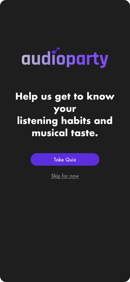
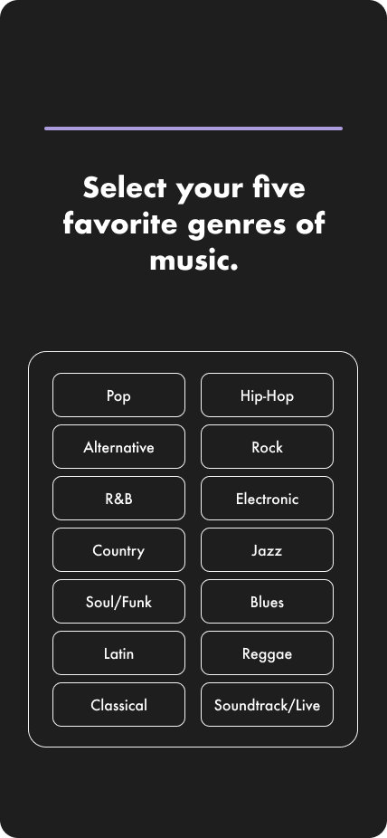
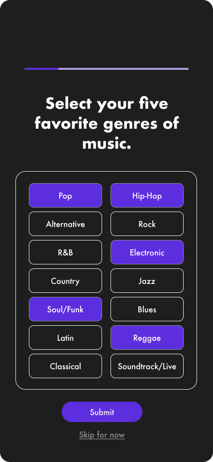
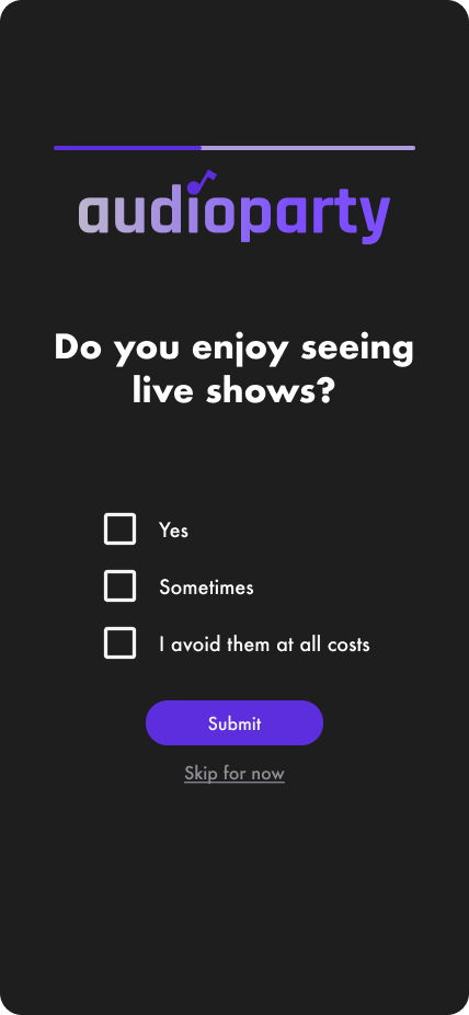
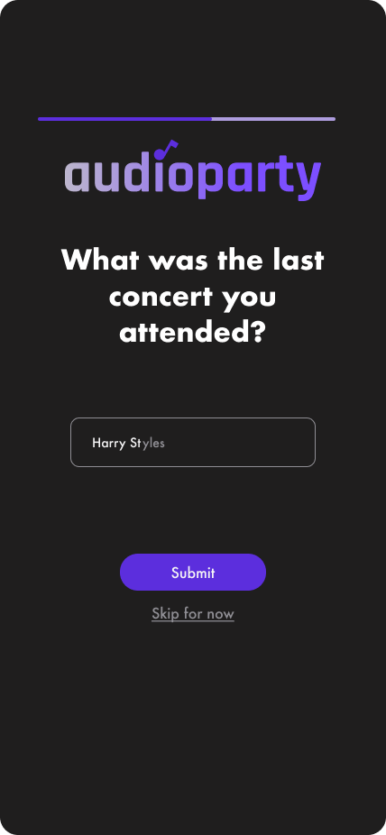
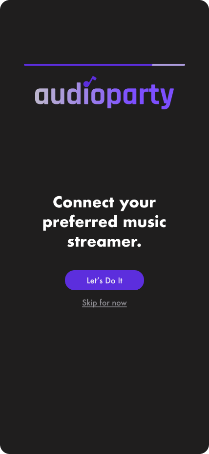
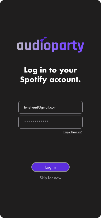
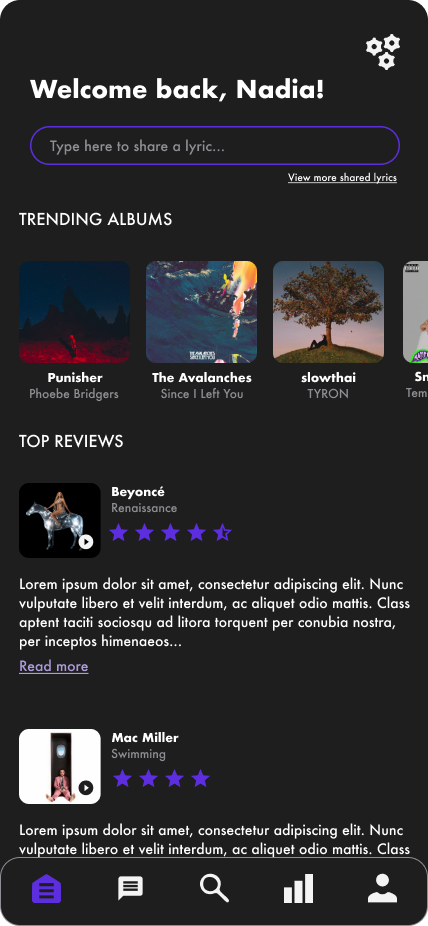
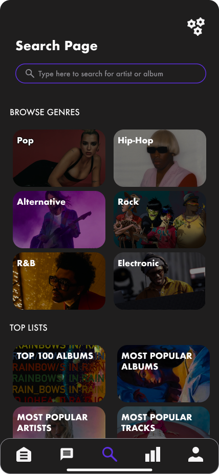
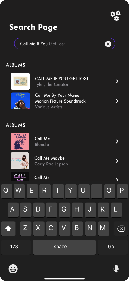
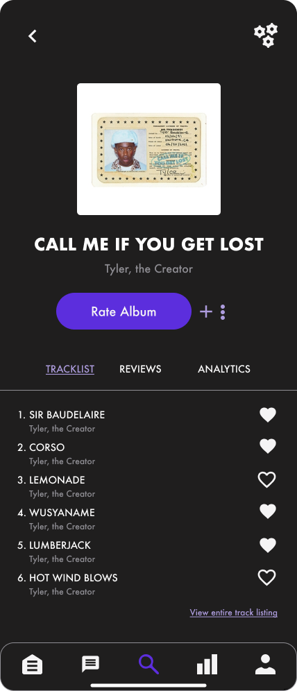
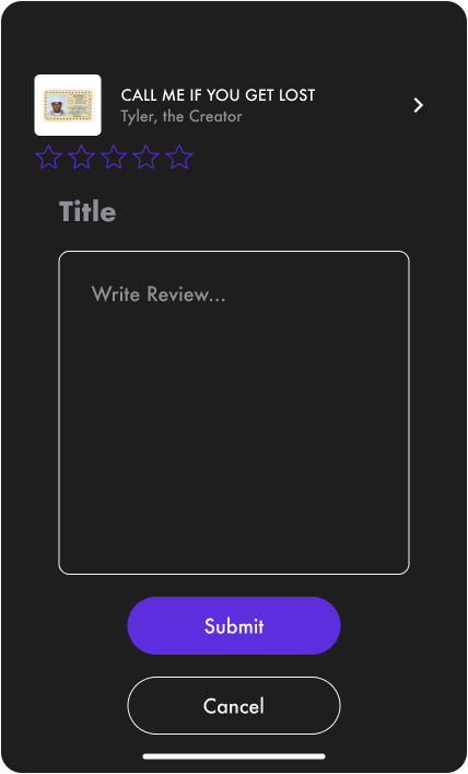


After determining my user flow, wireframing, and iterating on higher-fidelity mockups I was ready to prototype and go through user testing to find out if these flows would be intuitive and functional for a user.
DELIVER
Prototyping and Testing
Prototypes were created for all three of the designed user flows. My favorite part about this was not only seeing the designs come to life but especially seeing the loading circle compromised of musical notes in action. This was a design challenge I was really committed to and it felt extremely gratifying to see it executed successfully.
I recruited five participants, between the ages of 29 and 44, to test them.
Once again, the methods that seemed most applicable to this project was the Contextual Inquiry methodology. However, I also used Maze this time as scheduling didn’t align for a couple of the participants.
For the semi-in-person tests, I used Google Meet to observe firsthand the user’s process. I asked that the participants to narrate their experience and thoughts while moving through the flow.
Click on image to expand.
Priority Revisions
While the user testing overall provided really positive results, some testers were curious about the where the information collected during the onboarding quiz was stored. Because of this, I decided to add a pop-up that appears when you access the Home screen for the first time, letting the user know they can review this data in their user profile and that the quiz can be retaken at any time. Some users also confused the Share a Lyric on the Homepage as a search bar. I decided to leave it as is.
Click on image to expand.
Conclusion + Final Learnings
This project reinforced the importance of visual hierarchy and how even if just a single element is overlooked, it can throw off a user’s journey potentially contributing to them abandoning the product altogether. However, I also saw how thoughtful, consistent branding and UI can excite a user and encourage them to explore a product even further.
Next steps would include exploring other ways to display a ‘Share a Lyric’ feature to eliminate that tester confusion. I’d also like to design additional flows for accessing user profile, user messaging, and additional parameters to calculate listening metrics.
FINAL PROJECT INSIGHTS:
It felt extremely rewarding to see a project through from the root of the idea to the execution of its design. I felt really excited by this project and it was a challenge to prioritize certain flows over others, in the interest of time. It also helped solidify which elements of the design process I enjoy most, which is the actual design part. That said, thoughtful and intentional design is nearly impossible to accomplish without the foundation of customer empathy and the best way to build that is through applicable research.


