Shazam Record Pool Integration
Adding features to Shazam to leverage it to its DJ customer base.
Design Process
Click any button below to explore the different phases of this project.
PROJECT INSIGHTS:
According to djrankings.org, a data analytics tracking site related to DJs, there are upwards of 1,200 documented music genres jockeys can incorporate into their sets or repertoires. This means an open format DJ, an artist who chooses to cross genres might potentially have to track and stay on top of music from most of these genres. That’s a big responsibility for one person. Especially because, based on a report from Variety magazine in October 2022, an average of more than 100,000 songs are uploaded to digital services each day. This makes it a nearly impossible task to stay on top of not just what’s trending, but what is both niche, and middle of the road.
DISCOVER
During the discover phase, I first wanted to learn how DJ's currently discovered and acquired new music. Additionally, because record pool subscription prices can add up and there's no exhaustive record pool with every song ever created, I wanted to get a realistic sense of whether or not DJ's utilized them over free methods like illegally downloading. The Problem
As a part-time DJ myself, I’m aware of the ongoing mission it is for a DJ to search and discover new music. With the rising popularity of Shazam and its usefulness for users to discover new music and add it to playlists in Spotify and Apple Music, there’s still no way for DJ’s to sync their discoveries to their existing record pools.
The Solution
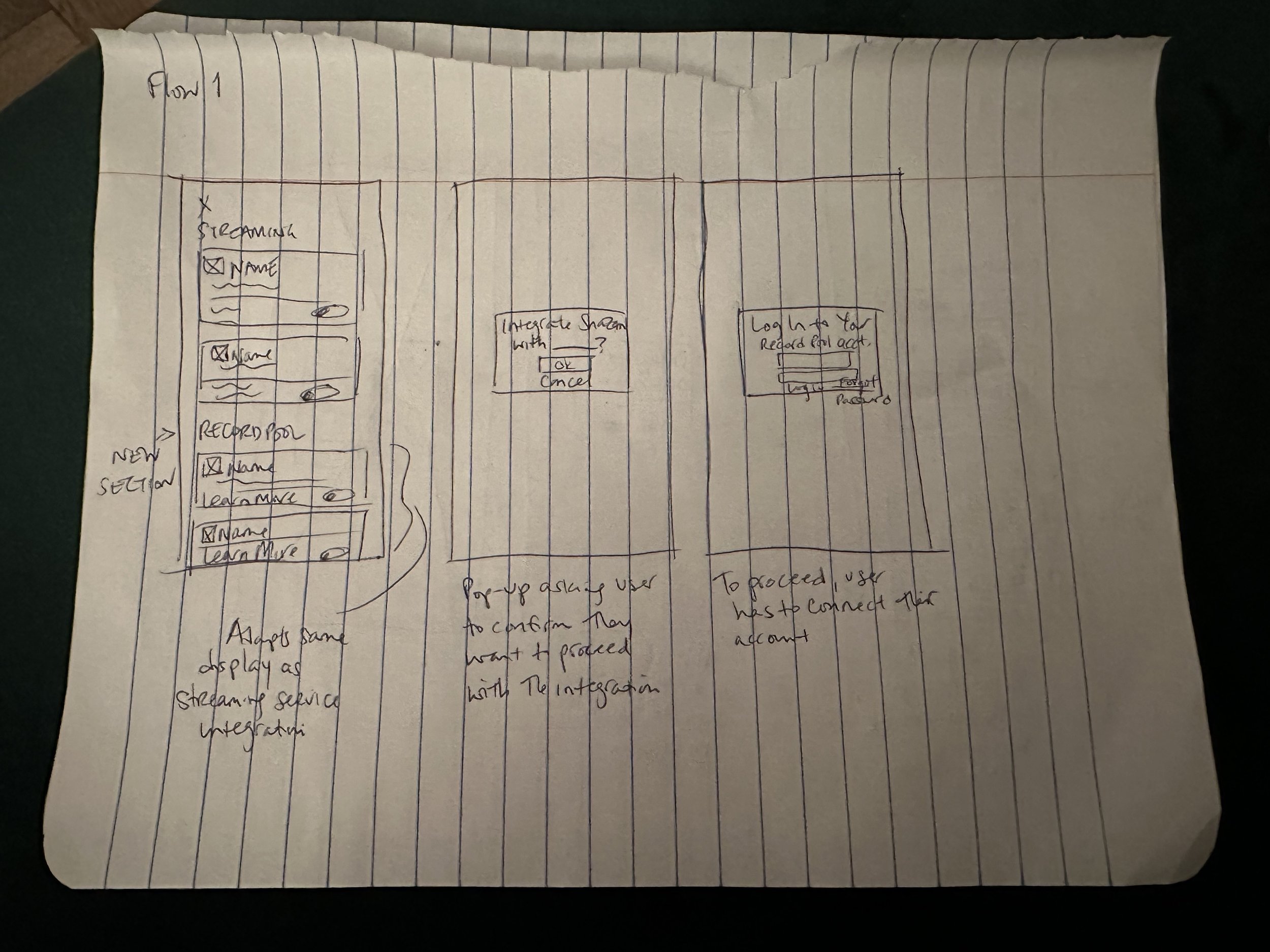
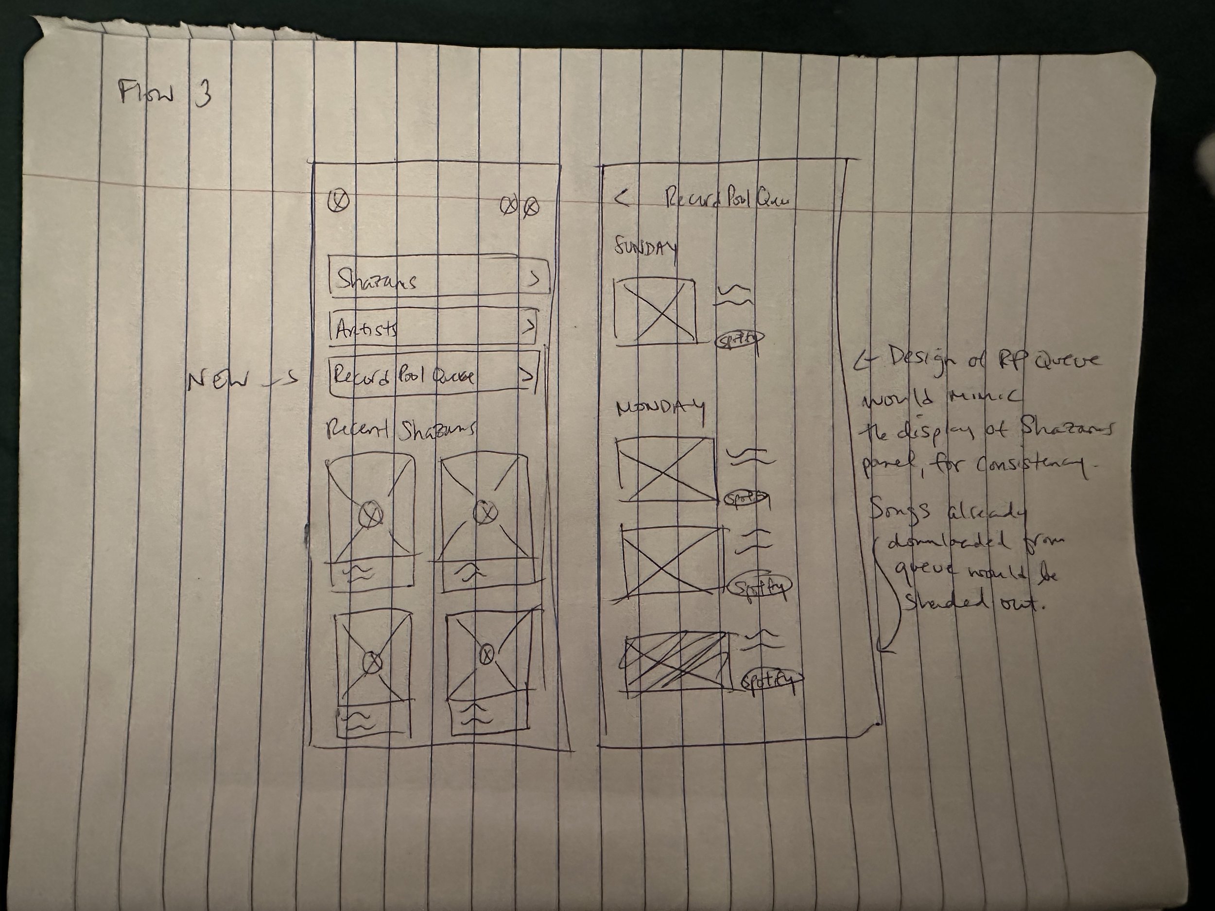
Create an integration flow that would allow users to connect the record pools they have existing subscriptions to, as well as an Add-To-Queue feature that would enable them to add discovered songs to a queue for later download in their integrated record pool. Additionally, design a queue viewing feature so users have a record of the tracks they’ve wanted to and have downloaded.
Goals
Design flows that are intuitive, seamless, and transparent to both the average user and a DJ.
Design features consistent with Shazam’s existing UI.
Offer a comprehensive record pool integration that could also incentivize a user to continue their subscription with their record pools.
Primary Research
During the primary research, I interviewed five different DJ’s ranging in both professional experience and employment status. Experience level spanned from 3-10 years. 70% of the DJ’s were active, working DJ’s. Gig frequency varying from one gig a month to 16 shows a month.
100% of interviews expressed a reluctance to spend money to acquire music.
4 out of 5 had one subscription to a record pool.
85% of participants said they’d likely be incentivized to subscribe if it was easier to download music discovered through apps like Shazam.
3 out of 5 participants acquired most of their music via illegal downloads, while the others used an even mix of buying individual tracks and illegal downloading.
Key Takeaways
Secondary Research
Moving on to the secondary resesarch, I used the Competitive Analysis strategy to see if and what similar services were doing to solve for this issue. I looked at direct competitors like SoundHound and Musixmatch. While these products had strengths like accessible navigations, streaming integrations, and built-in lyric translations. None of them had any integrations with record pools.
I also looked at indirect competitors, Apple News and Pocket to see how their add-to-queue features worked. While both services had clear buttons for a user to save articles, there was a lack in communication when it came to where a user could find their saved items and an inconsistency in terminology.
All of these weaknesses provided beneficial guidance when it came to considering how I want my features to be displayed in Shazam’s existing interface.
When it came time for the Define part of the design process, I wanted to ensure I was incorporating the most important details from the User interviews and Competitive Analysis into a realistic prospective customer.
Click on image to expand.
DEFINE
User Persona
As I sythencized my research, some glaring similarities in DJ-ing goals came to light. When it came to the goals and desired perceptions of my interviewees, all of them wanted to limit their spending but remain on top of music relevance. The latter seemed to be more important in a lot cases. That became the crux of my User Persona. I developed the below persona, Max. A 33 year old, full-time DJ based out of Los Angeles. His goals and motivations are to acquire music in a cost effective way, expose his audiences to new, less familiar music, but lean into versatility when his audiences want to hear more chart toppers. His fears are spending money unnecessarily, spending more than his take-home income, and musical discrepancies in his library that would prevent him from booking more jobs.
Click on image to expand User Persona.
While the research part of the project was very apparently important to the design process as a whole, I was really excited to finally dig into the the user flow and site layout and design to bring the ideas I had been visualizing to life.
DEVELOP
User Flow
Once I had the idea of Max in mind, I could imagine the kind of flows that would both respect his limited time and allow him to officially organize and access his discovered songs for download within a record pool. The User Persona also informed me which record pools would be the best to integrate Shazam with.
For this project I focused on three flows:
Record pool integration
Add to queue feature
Accessing the queue
Goals
Integrate with commonly used record pools
Queue based storage of discovered songs
Option to add discovered songs to a queue
Design that doesn’t clutter and feels natural to the existing interface
Wireframing
Once I had each flow mapped out I started wireframing. I really enjoyed the new challenge of designing within an interface that already exists. This made me feel like I was working with real life stakes and added a specific structure that I didn’t have on the first Capstone. I find that I can get pretty carried away design wise and I like to test ideas that might not necessarily be what you’d see on an average interface, so this strategy forced me to reel in that imagination. This was super helpful since I was working on a strict 4-week timeline. To begin, I started with paper wireframes.
Branding & Style
Now that I had the skeleton for my design, it was time to think of the site’s branding. One challenge that felt eliminated due to the nature of the project was the product’s Style Guide as the site’s color palette and text was already decided for me. However, now I had to ensure that any components I created, matched that same UI.
High-Fidelity Mockups
Now that I finalized my style guide, it was time to build the high fidelity mockups.
After determining my user flow, wireframing, and iterating on higher-fidelity mockups I was ready to prototype and go through user testing to find out if the website would be intuitive and functional for a user.
DELIVER
Prototyping and Testing
Prototypes were created for all three of the designed user flows. I recruited five participants, between the ages of 30 and 44, to test them.
Similar to the previous project, I used the Contextual Inquiry methodology. I really appreciated this strategy because it provided insight into the participants motives and obstacles. It also provided me with the opportunity to ask follow up questions, should anything about their process not make sense.
I used Google Meet to observe firsthand the user’s process. I asked that the participants vocalize their thought process while moving through the flow.
Click on image to expand.
Priority Revisions
There was no display of how songs from the record pool queue that had already been downloaded would be displayed in the queue. To communicate that to users, I showed the thumbnails shaded out.
Click on image to expand.
Conclusion + Final Learnings
I was really happy with how the application of my research and user testing came through in my designs. It can sometimes feel difficult to match the idea of what your design intention looks like in your head, on paper. I do feel as though the final designs came pretty close to what I had been imagining when I came up with this design.
This was the first time I completed a project where I had to add features to an existing app. It presented it’s own challenges: creating designs seamless with the existing UI, accounting for the current visual hierarchy, among others.
If I was to continue on with this project, I’d love to investigate on whether these features could be useful for the Shazam demos beyond DJ’s.
Since my priority revision was minimal, all prototypes remained the same except for the Viewing the Queue flow.
FINAL PROJECT INSIGHTS:
I really enjoyed this project. The challenge of adding an existing feature into an interface and style guide that already exists felt invaluable. If I had more time I would’ve loved to explore what the queue and download process on a presumably integrated record pool would look like as well. That said, I feel as though I really tapped into my customer empathy to build these features as well as the accompanying messaging.


